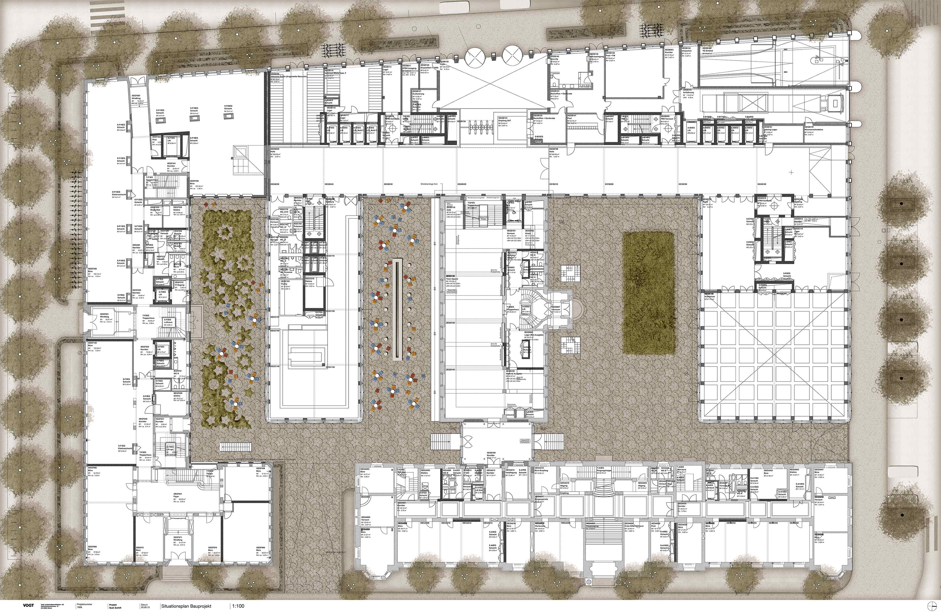
The global headquarters of the Zurich Insurance Group at Mythenquai Zurich combines the company's diverse history with the location where it has been based since 1901. A fundamental redesign combines the historic with the modern and transforms the place into an attractive campus. The environmental design of the new Quai Zurich Campus refers to the overarching green and open space structures. It creates attractive recreational spaces of ecological and design quality for employees and visitors. The area as a whole and its parts are designed to preserve the historic character and achieve the best possible overall effect. The design refers to the representative buildings on the lakeshore and Alfred-Escher-Strasse to maintain and positively reinforce the ensemble effect. The result is three different, powerful and attractive types of greenery: The front gardens, the inner courtyards and the interior spaces.
The front gardens
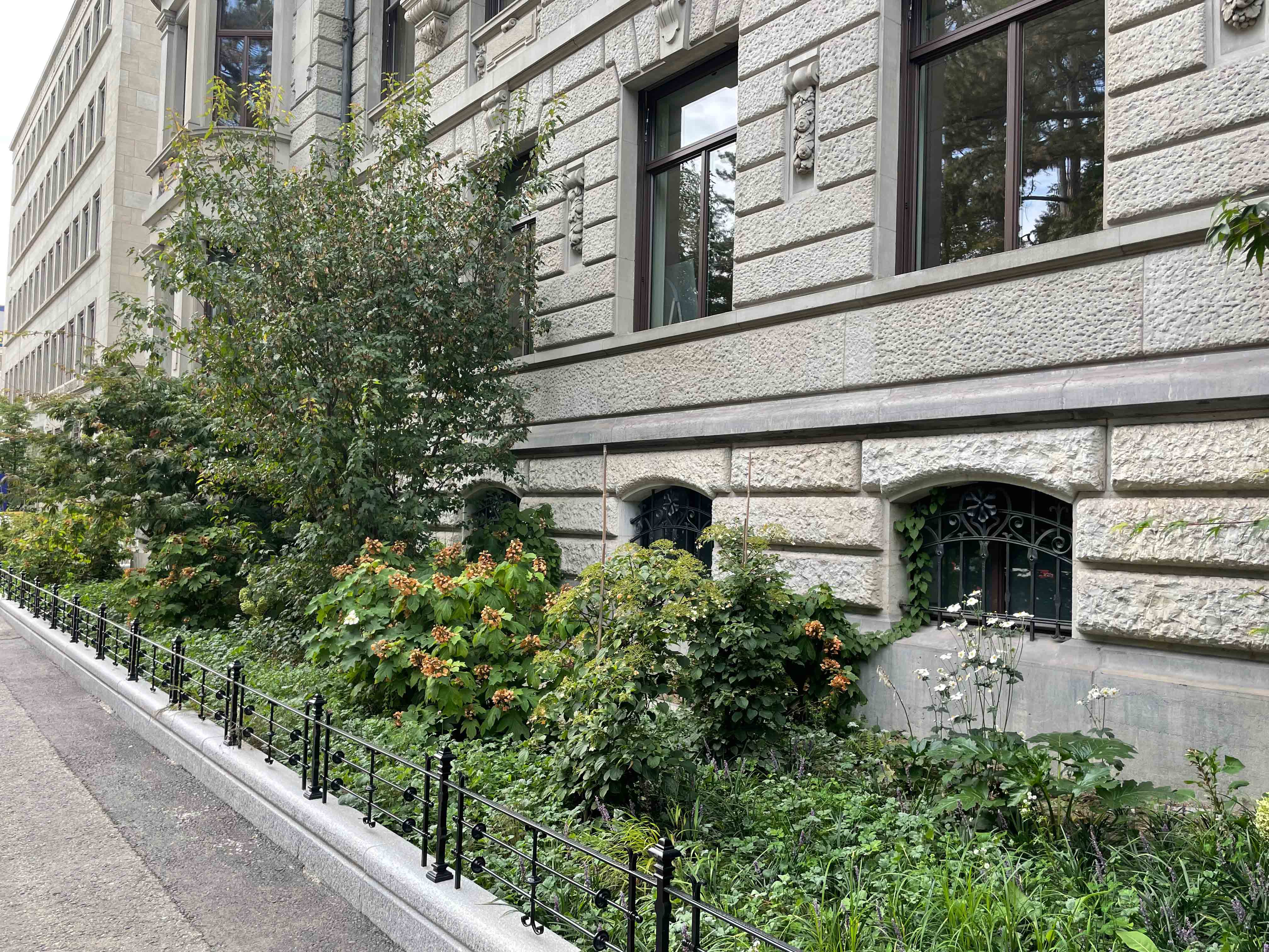
The new front gardens emphasise the continuity of the open space elements in the context of the existing street space on Mythenquai and Alfred-Escher-Strasse and connect the buildings of the district, which differ in their period of origin and architectural language. At the same time, they establish an overarching connection to the open spaces of the neighbouring properties.
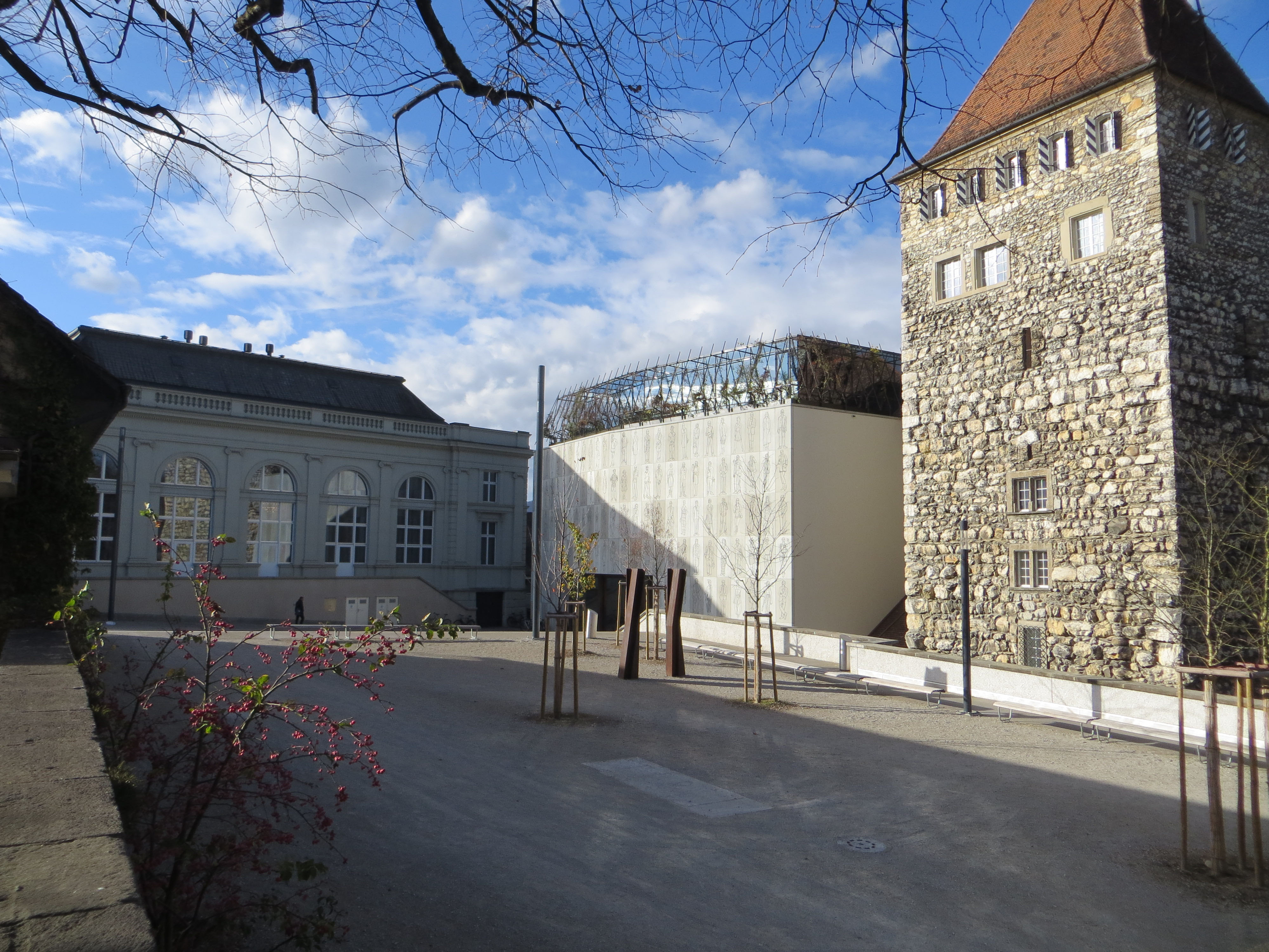
In their parts, the design of the front gardens refers to the respective historical and stylistic classification and formal language of the buildings. The front garden of Building A, which is worthy of protection, was restored to its original high-quality design from 1935. In addition to the historic plinth wall, the representative address of the Zurich Insurance Group on Mythenquai is characterised by the planting of medium-sized garden shrubs and perennials: in addition to fire maple, fan maple and Japanese maple, various types of hydrangea can be found. But there are also ornamental perennials such as hogweed, wood honeysuckle, show-leaves and funcias, various geophytes such as anemones and narcissi, or ground covers such as carpet dogwoods, stork's bills and snow roses.
Since Building F is stylistically classified as "strongly objectified neo-classicism", the design of the front garden is oriented towards its strictly axially symmetrical and horizontally appearing street façade. The historic plinth wall is followed by a hedge of evergreen privet, covering the height difference between Marsstrasse and the building and placing the only entrance in the centre. Already part of the historical design from 1932, the hedge band is supplemented by individual medium-sized garden shrubs such as magnolias and lilacs.
Along Alfred-Escher-Strasse, the theme of hedge bands is also taken up. Several continuous, trimmed hedge bodies of privet, gingerbread tree and copper beech were supplemented with different dogwood varieties and ornamental cherries. The design of the hedges, which are staggered in height, refers to the modern façades of the new Building B. They connect the various entrances, escape doors and the new driveway. In autumn, each row shines in a new colour. In autumn, each row shines in a different colour, while the leaves of the Japanese cake tree smell of gingerbread when they fall to the ground.
The courtyards
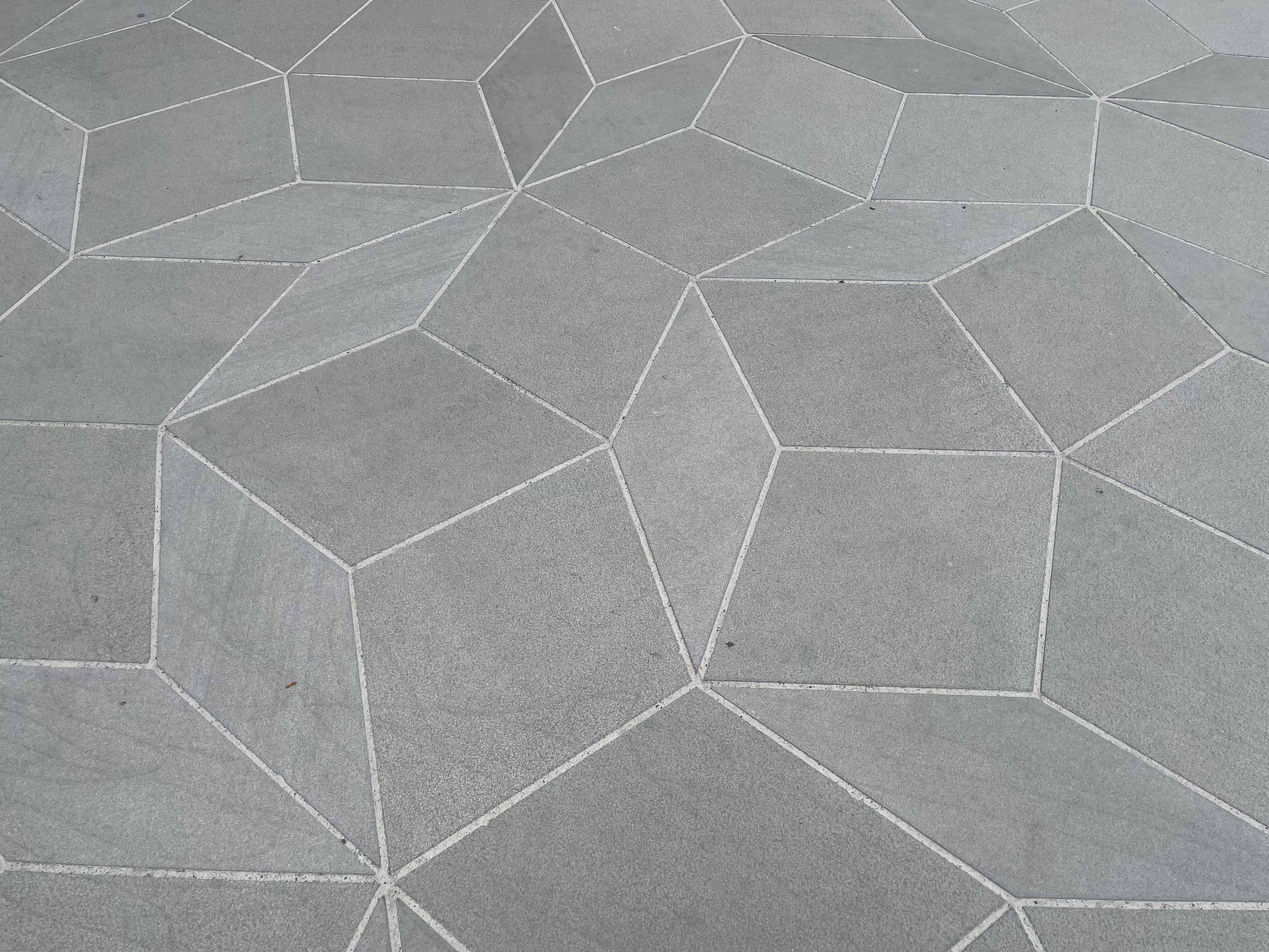
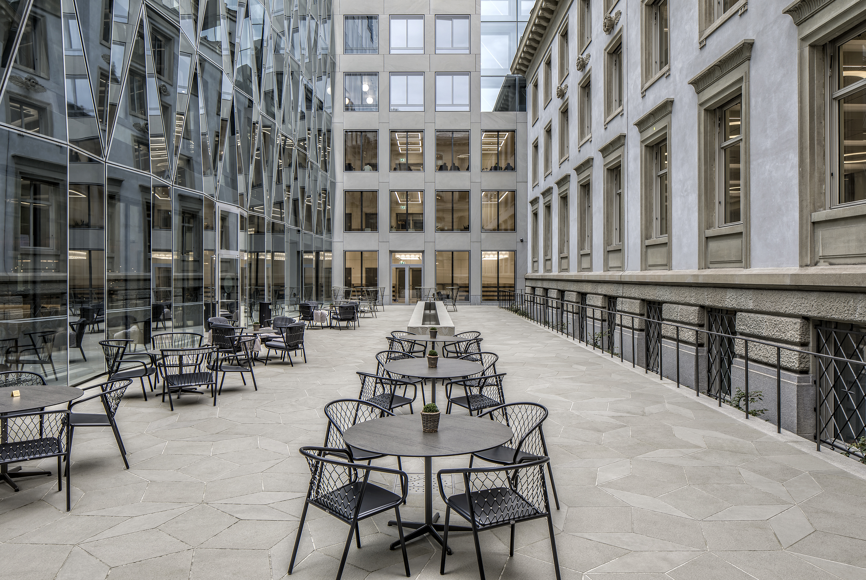
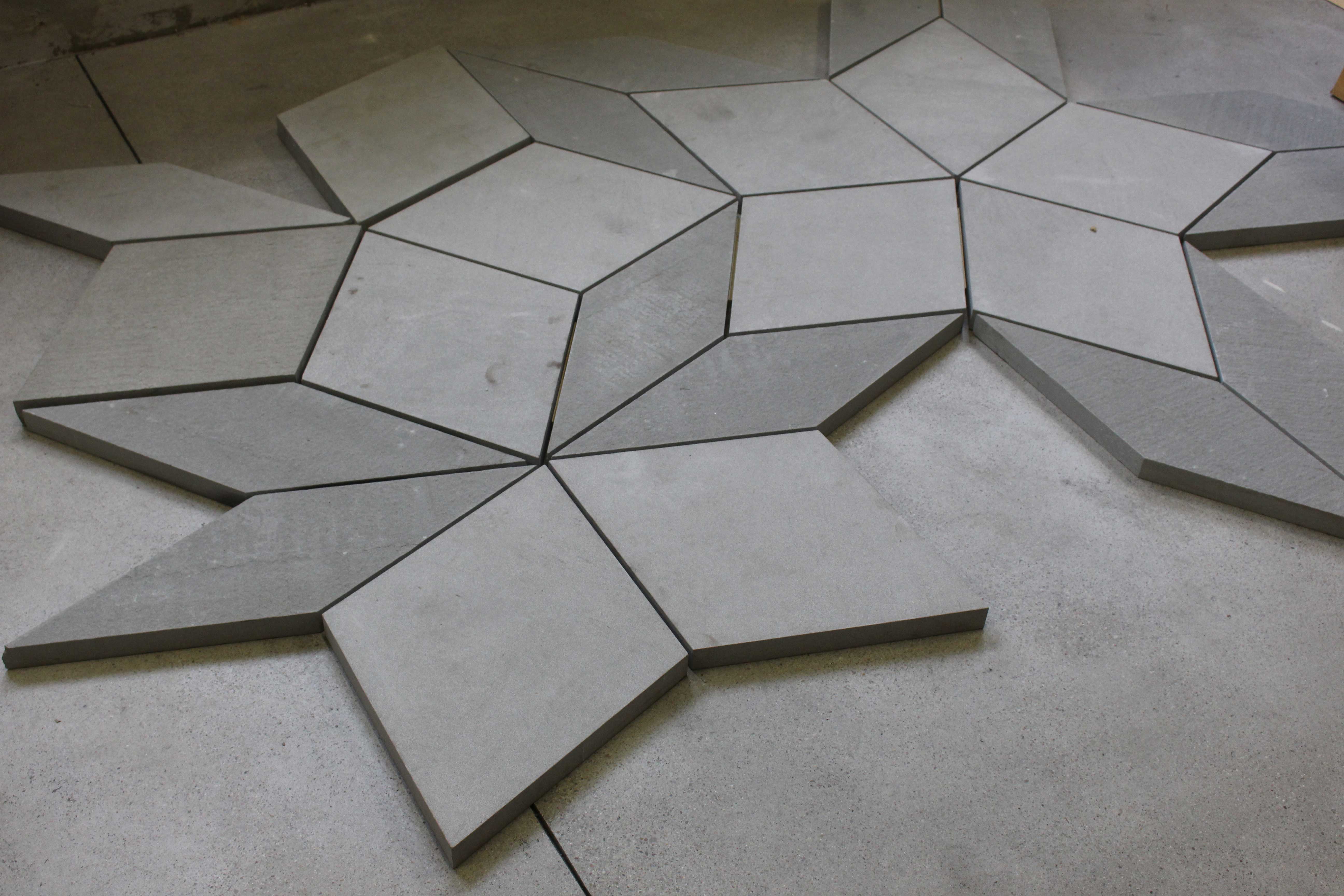
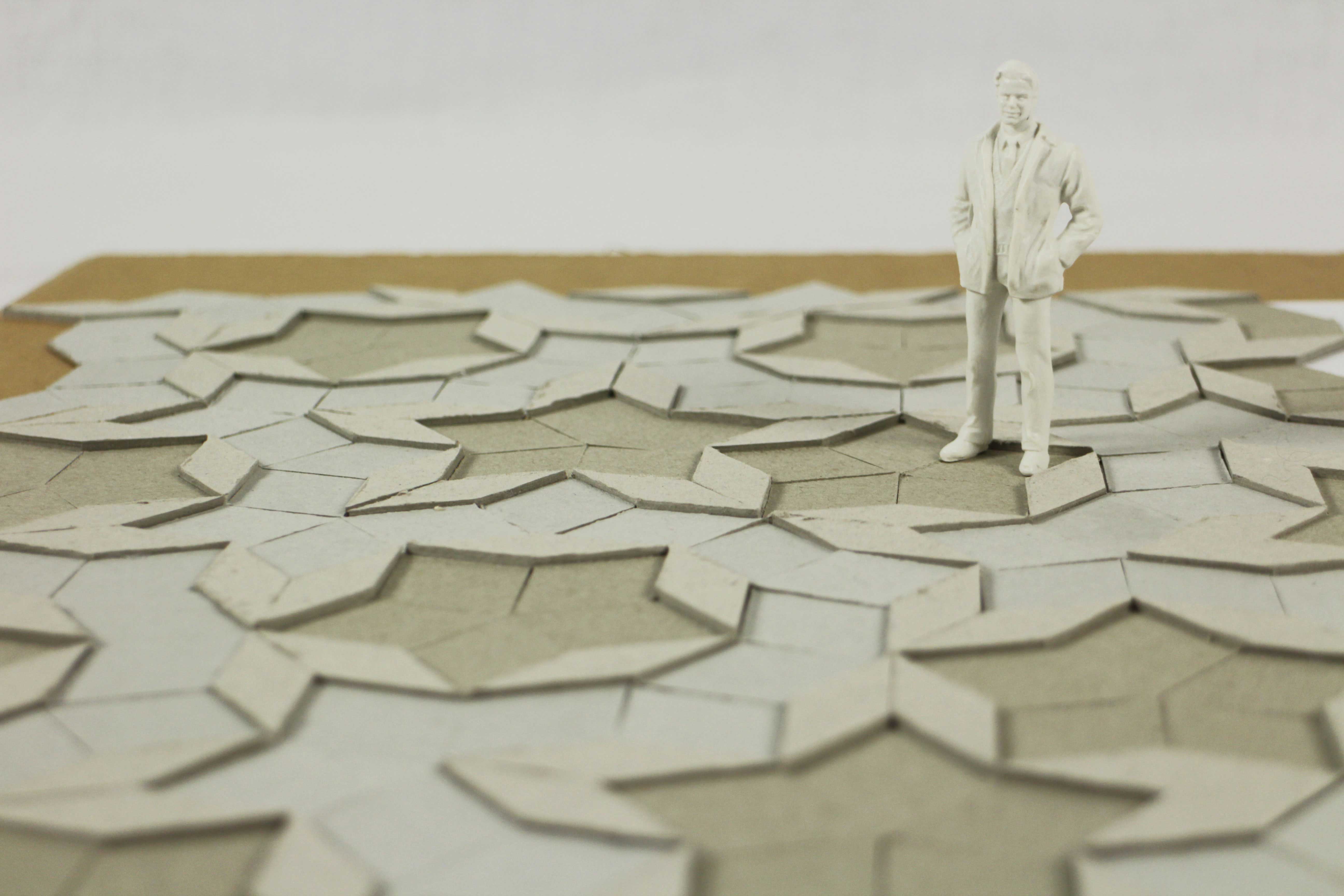
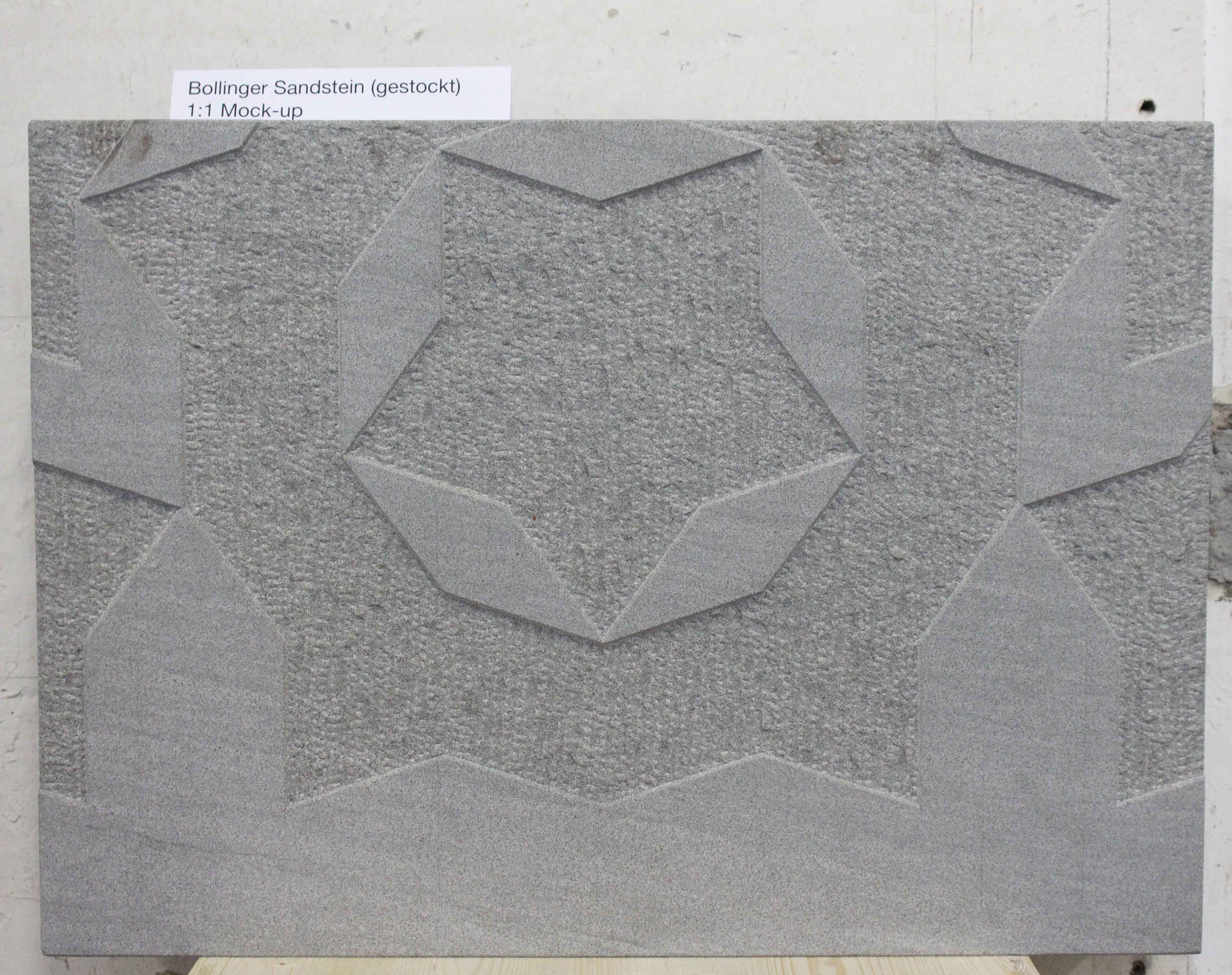
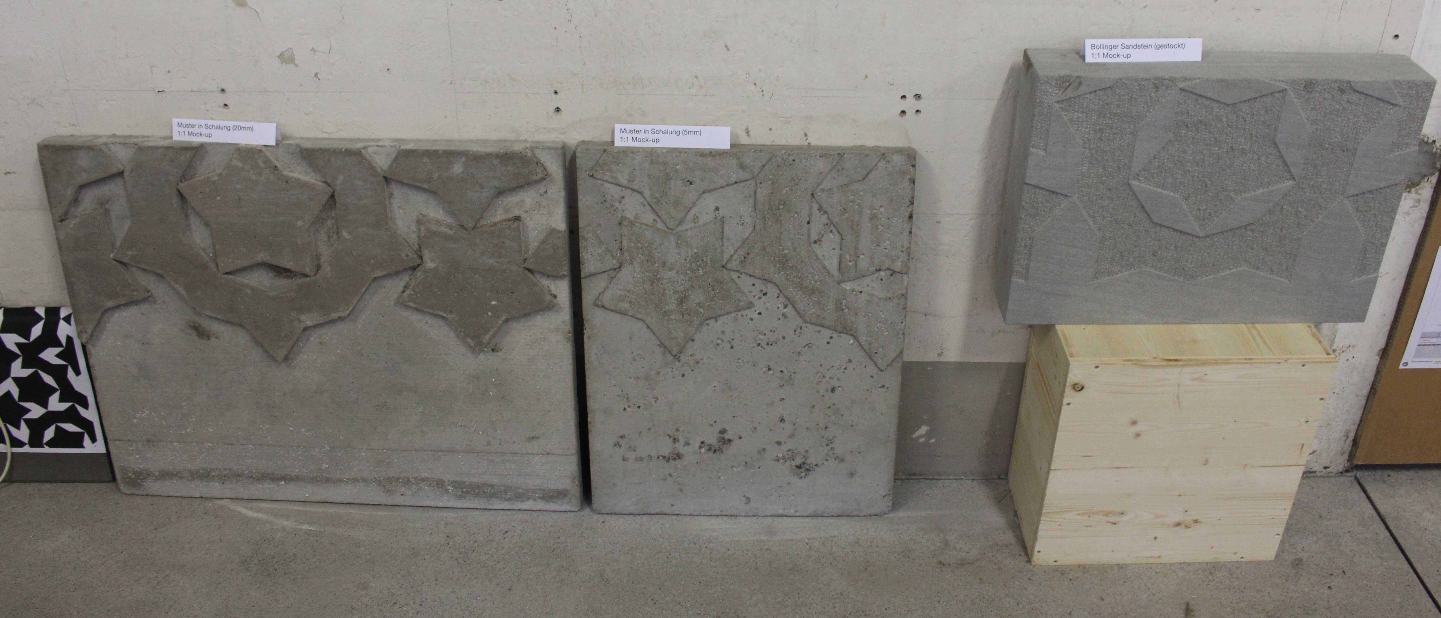
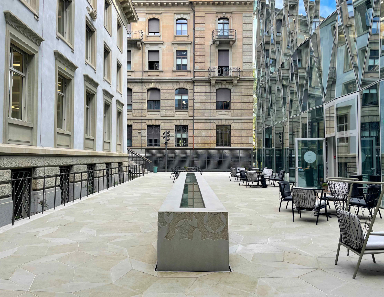
The outdoor spaces inside the campus offer various opportunities to spend time with high design quality. Necessary compromises between usage requirements, structural framework conditions, archaeology, and ecology yet don't diminish the design quality. A stone carpet of natural stone slabs with a continuous pattern connects the building ensemble and the three courtyards. The Bollinger sandstone used for this is quarried at the southern end of Lake Zurich and is deeply rooted in the architectural history of the city of Zurich.
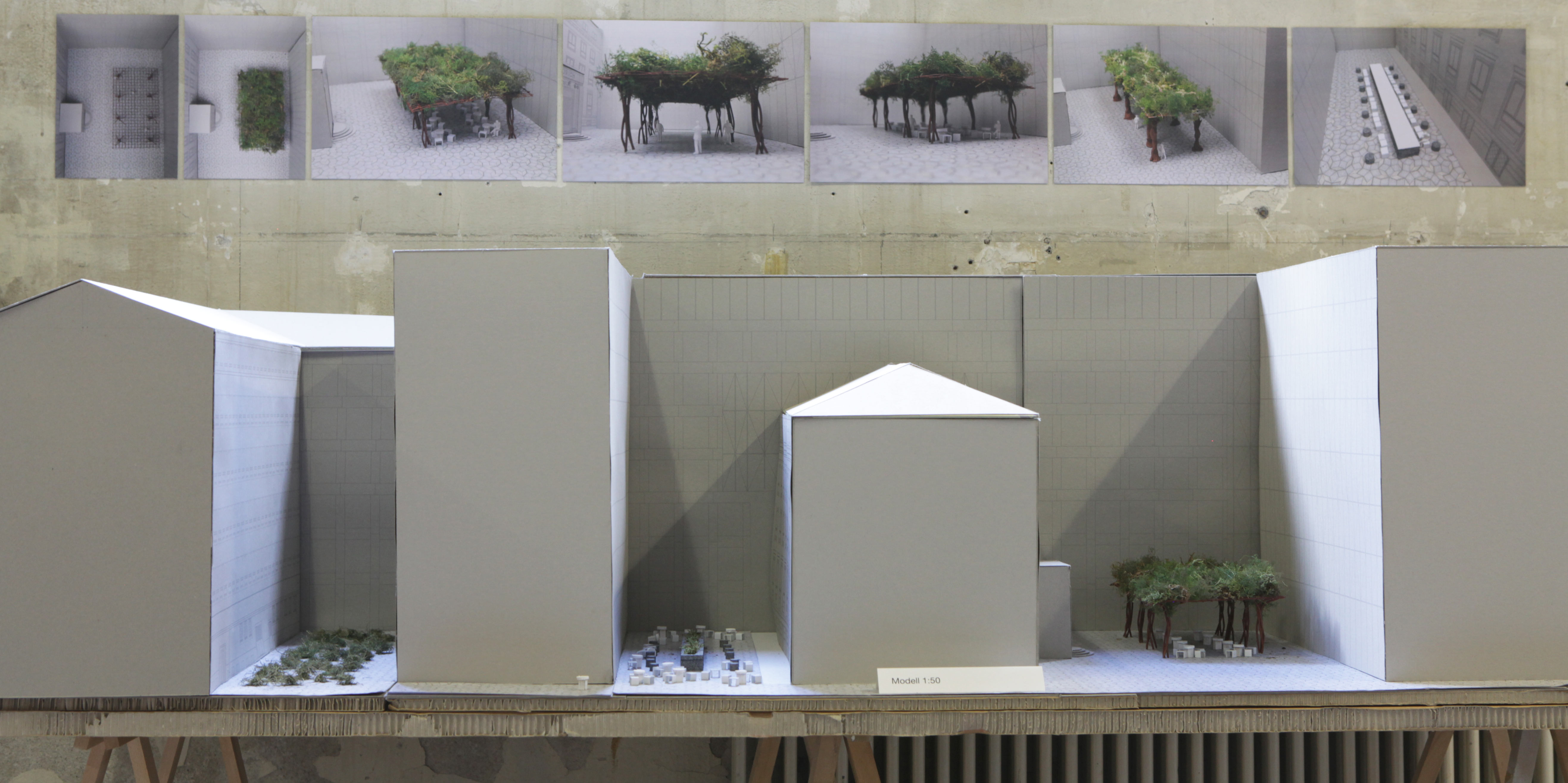
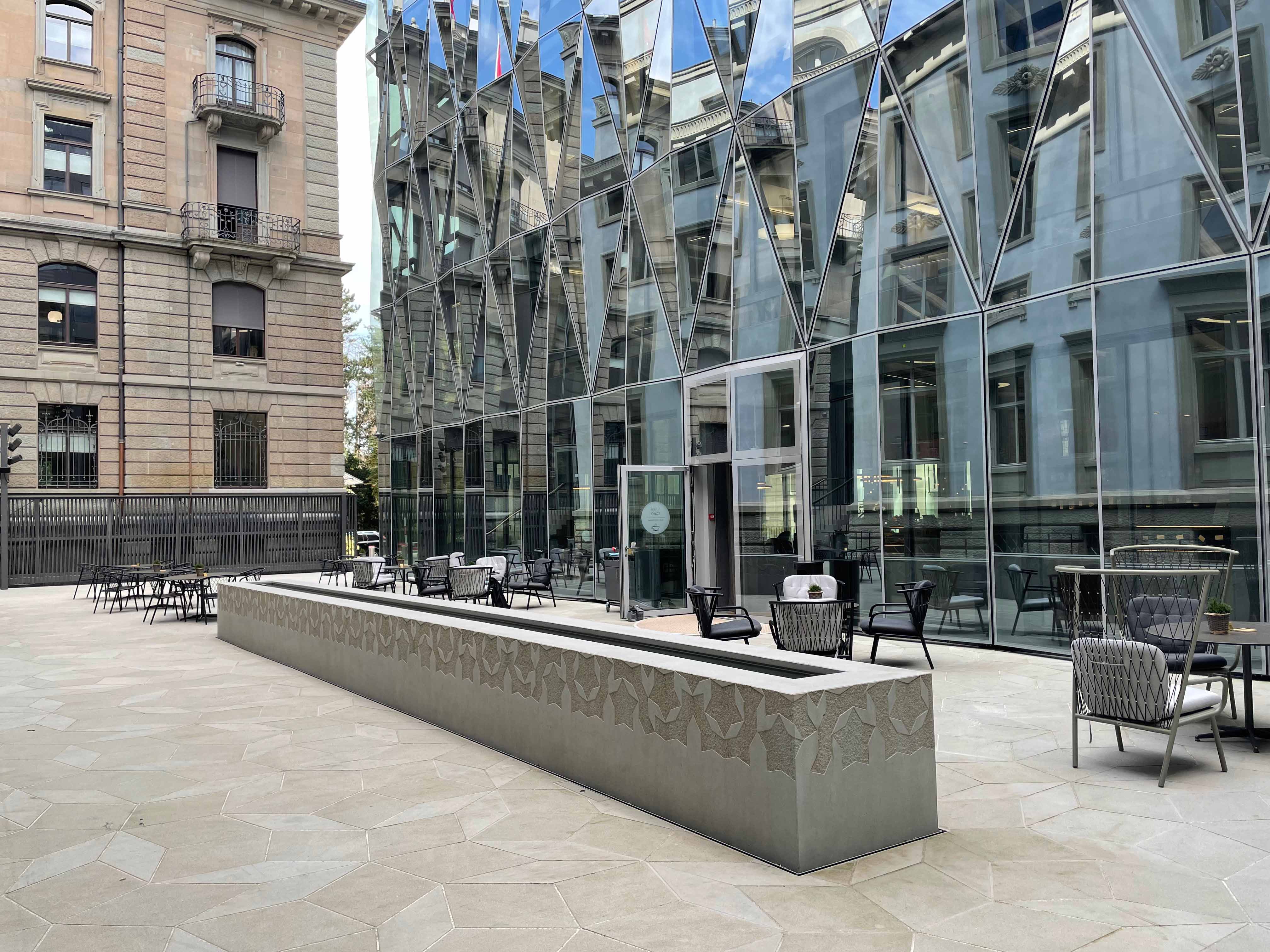
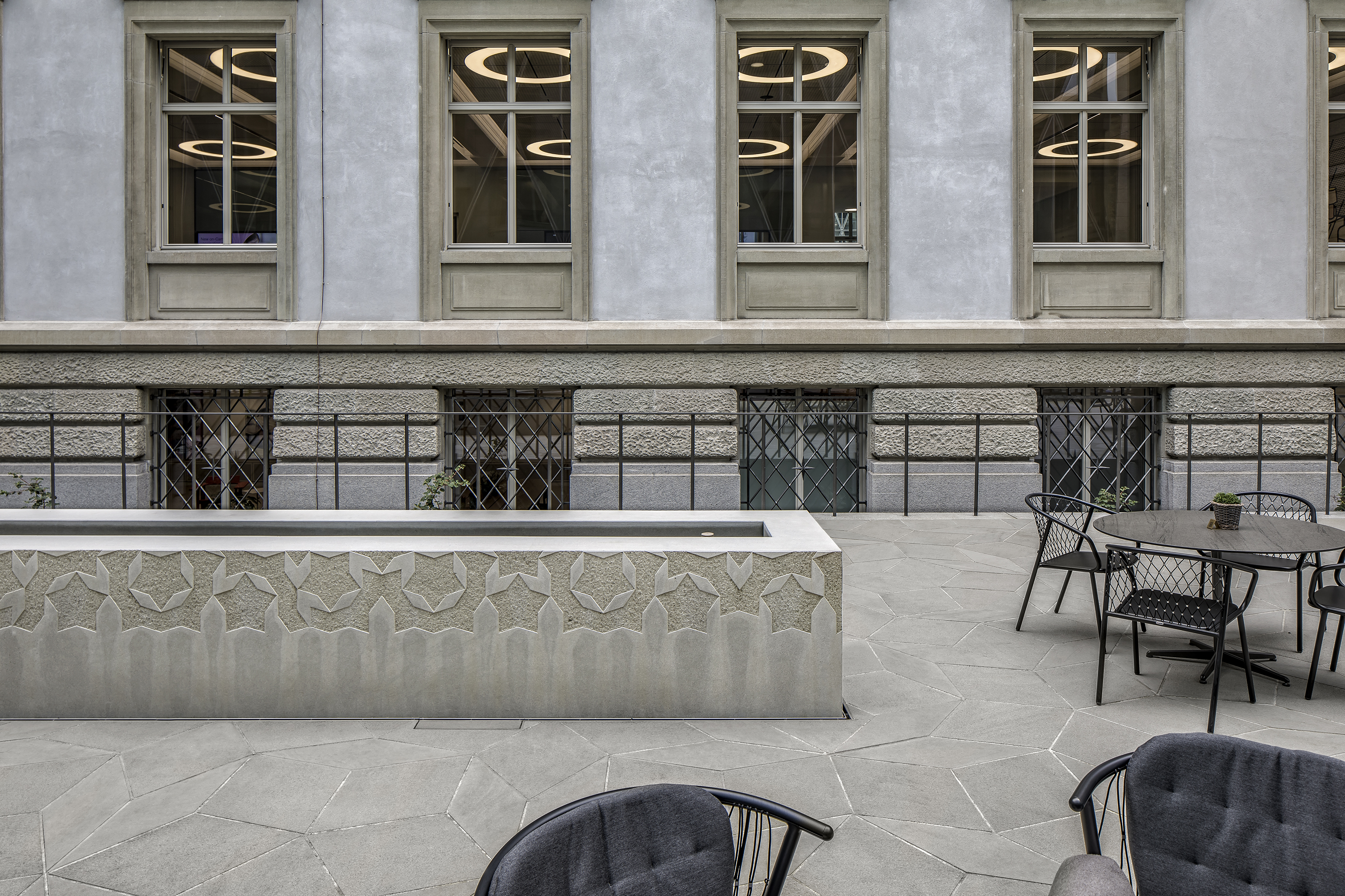
The pattern of the carpet makes use of the mathematical phenomenon of Penrose parquetry. The aperiodic tiling pattern makes it possible to parquet levels without gaps and without periodically repeating a basic pattern. It is the only way to create an irregular pattern with only two different basic figures. The given framework conditions limit the possibilities for the use of plants in the design of the completely underbuilt courtyards. Due to archaeological layers and the resulting need to preserve the floor slab, only a shallow construction height remains for vegetation. The year-round shading of large parts of the areas in the relatively narrow inner courtyards makes plants even more difficult. In addition, staff and visitors require functional areas. The central courtyard is used for outdoor catering, and the northern courtyard is a multifunctional area and an extension of the auditorium into the outdoor space. The principle of three vegetation levels was developed from the given conditions and requirements. Plants on the ground in the southern courtyard, plants in the water in the middle courtyard, and hanging plants in the northern courtyard.
Southern courtyard
The southern courtyard is primarily seen as an image that can be perceived from the building. Here, Ophiopogon japonicus was planted, which as an evergreen and shade-tolerant plant creates a dense carpet within the stone ornament.
Central courtyard
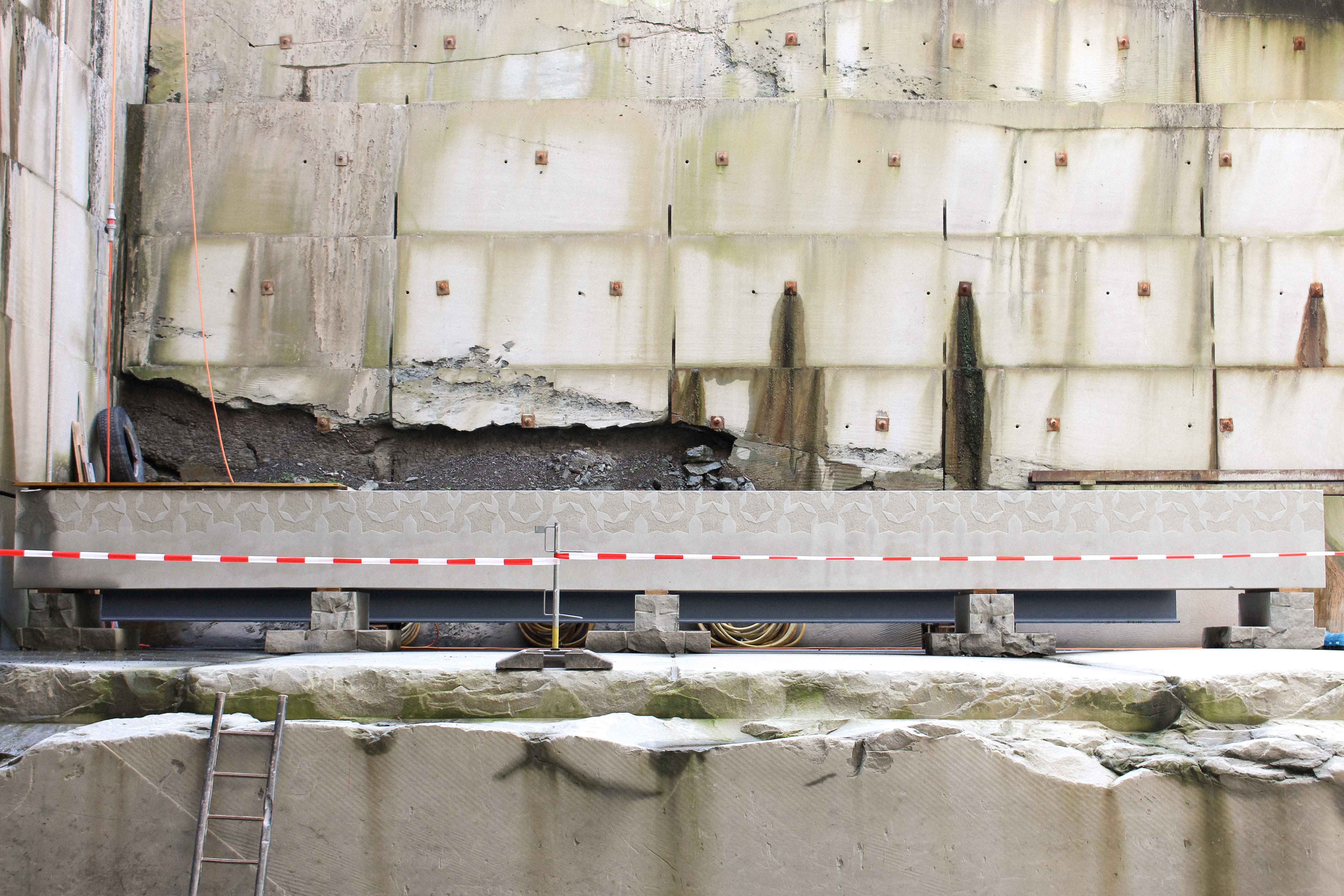
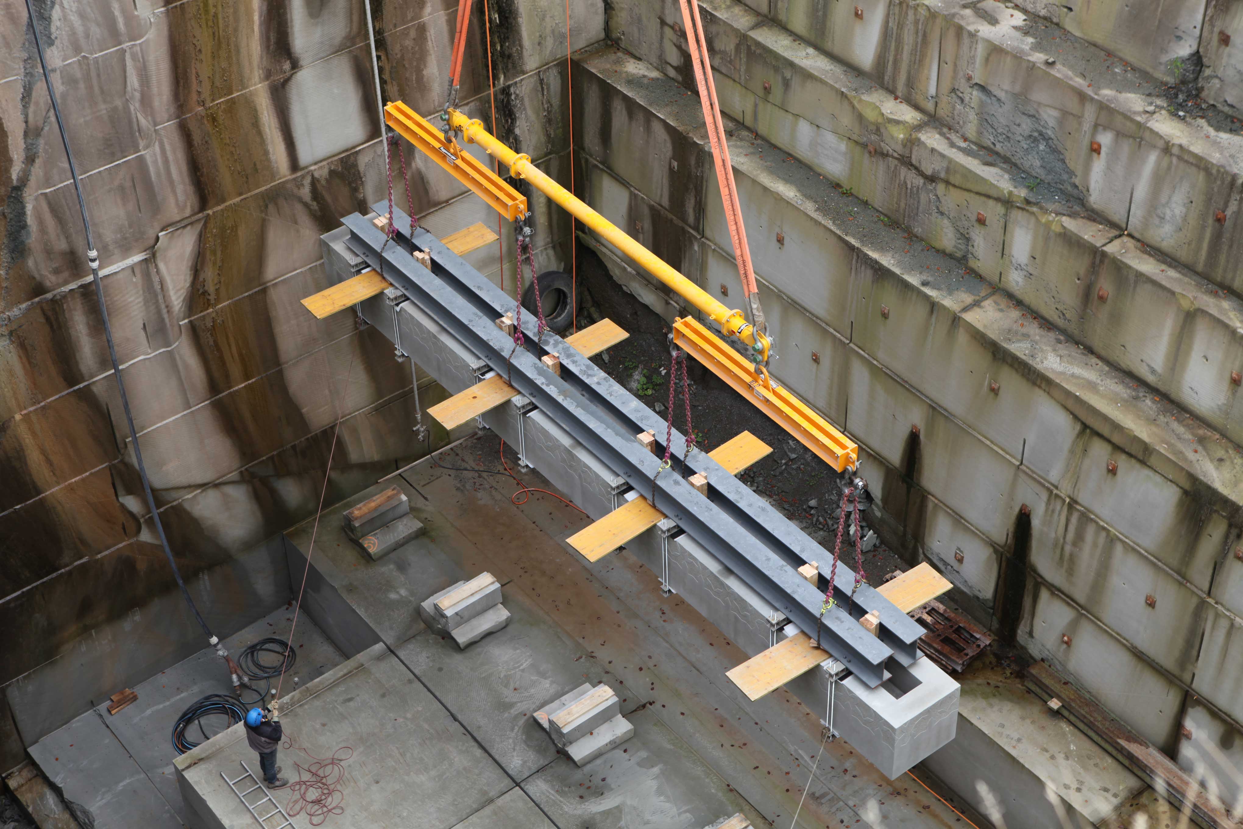
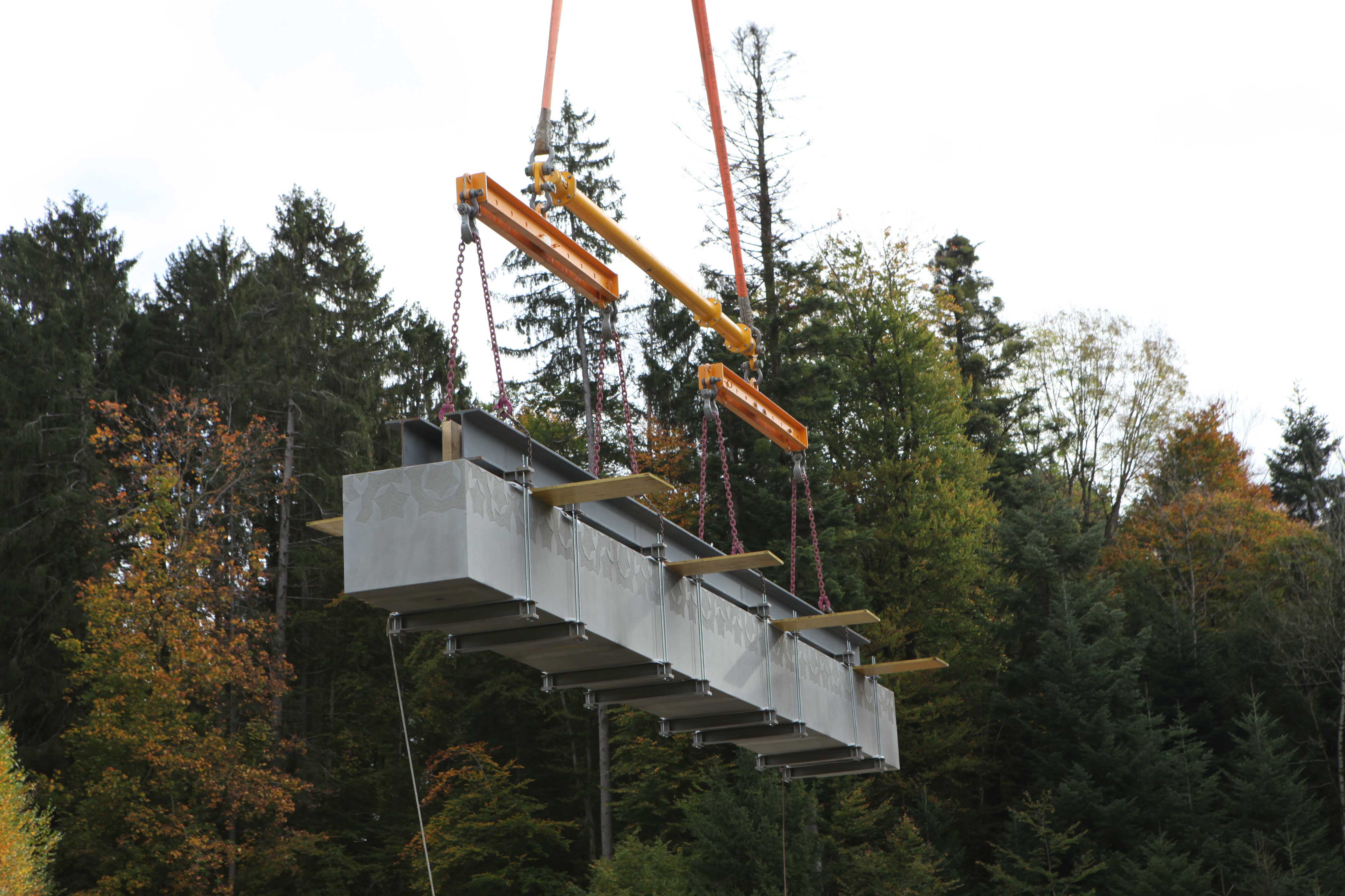
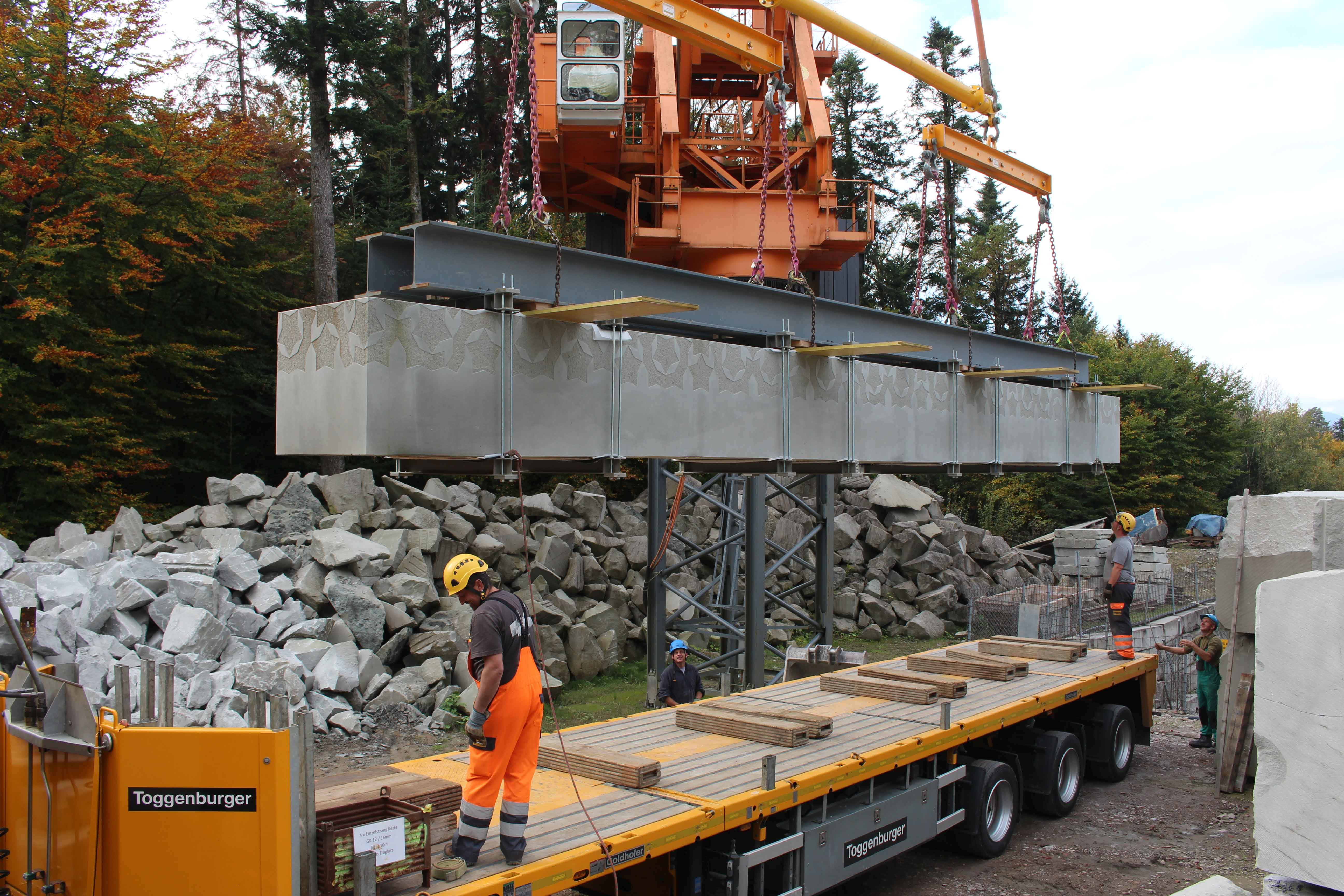
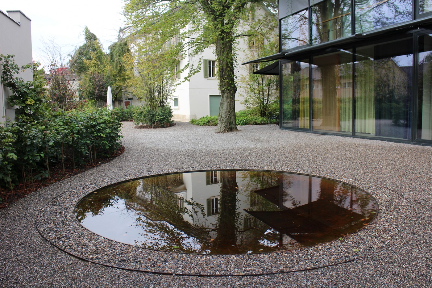
The central courtyard is characterised by its gastronomic use and its furniture, whereby the outdoor seating is omitted in the winter season. The limited possibility of using vegetation requires alternative elements that zone the outdoor space and create a pleasant atmosphere all year round. An additional feature was therefore sought that would provide a stable spatial structure and at the same time create an atmospheric design for the courtyard. An element that fits in with the use of the restaurant and makes a relationship to it. The "Cardinal's Table" in the garden of Villa Lante in Viterbo served as inspiration. This stone table with a water channel filled along its longitudinal axis was used to cool wine and fruit. On the Quai Zurich Campus, the covered water table also serves as a buffet or dining table.
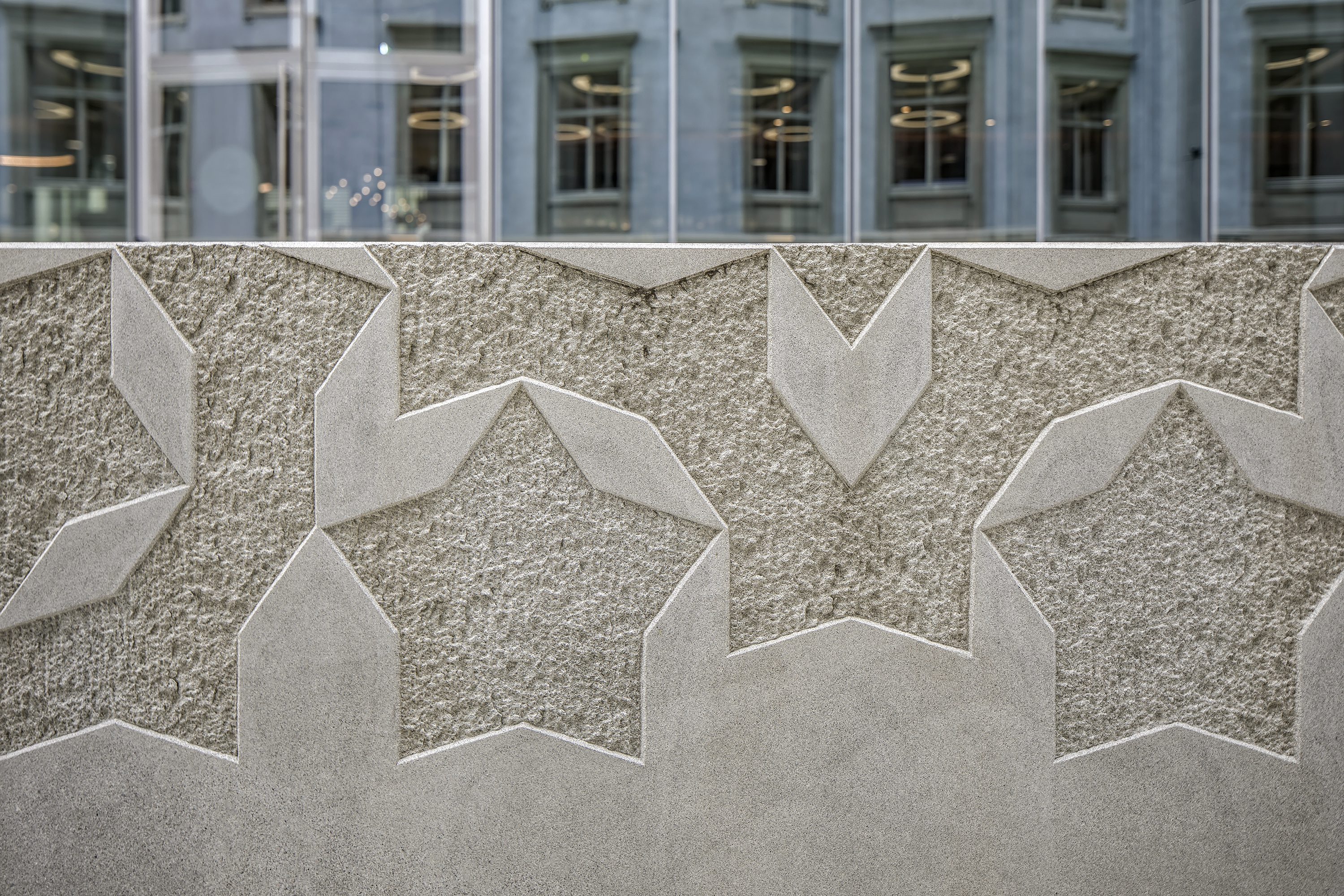
The subtle connection to the gastronomic use of the courtyard is further emphasised by the painting "Still Life with Cheese" by Florenz van Dyck. The painting viewer is presented with a set table, with food and place settings arranged on a tablecloth. It is the basis for the food presented and emphasises the colours and patterns of the table. Like van Dyck, the monolithic water table was extended by this additional element of the "tablecloth". However, instead of being placed on the table, it is an integral part of the massive structure. It refers to the stone carpets of the courtyards, the patterns of which are engraved as borders on the sidewalls of the table in elaborate handwork. But the monolith is not just a simple table. The water in the stone channel offers the possibility of using vegetation as a substitute for the missing substrate. Through the use of water plants, a special kind of greening occurs, which reacts to the special conditions. The vegetation provides a discreetly cool and humid microclimate, while the leisurely flow of water on the surface of the stone giant creates a pleasant dynamic.
Northern courtyard
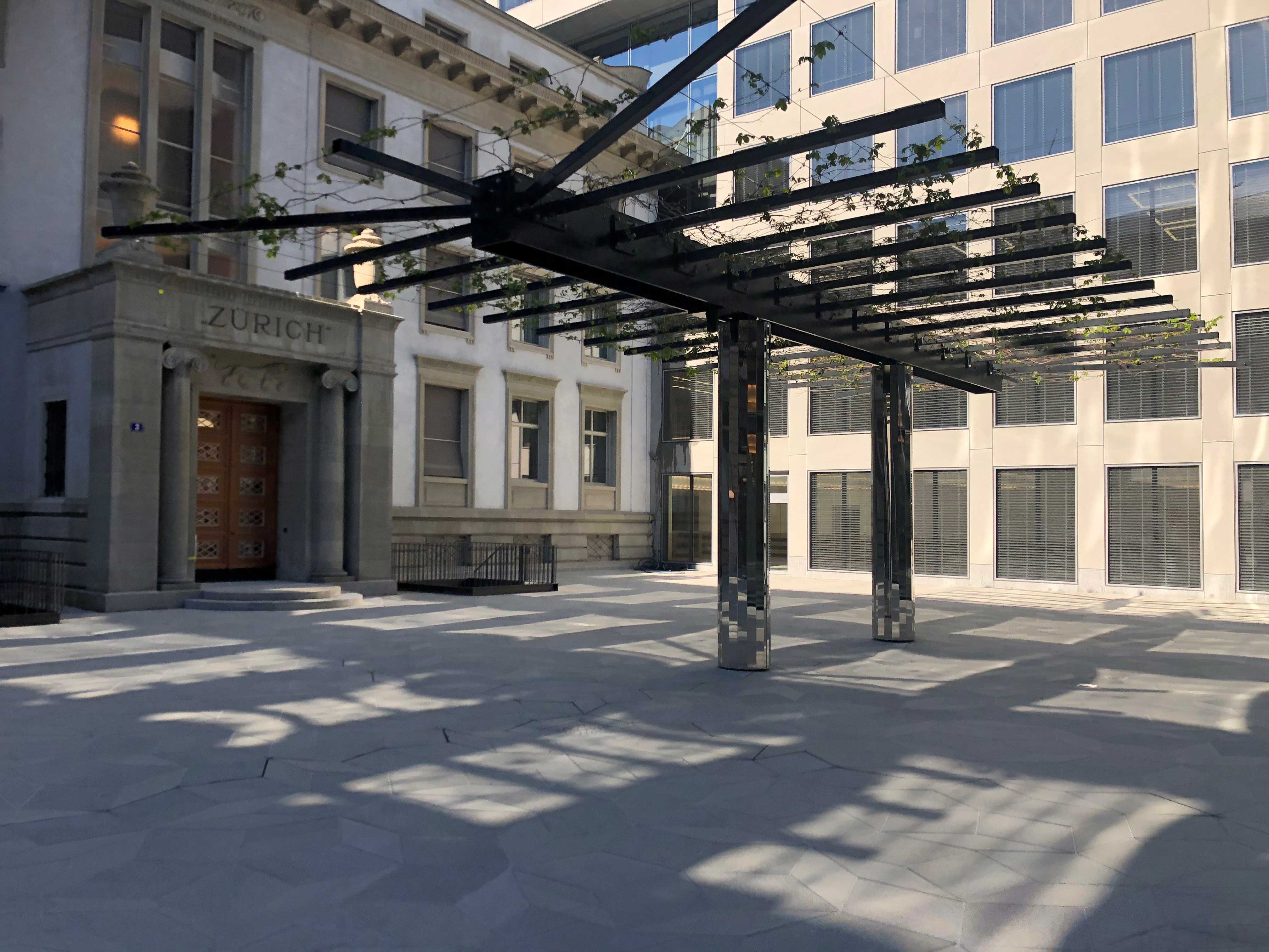
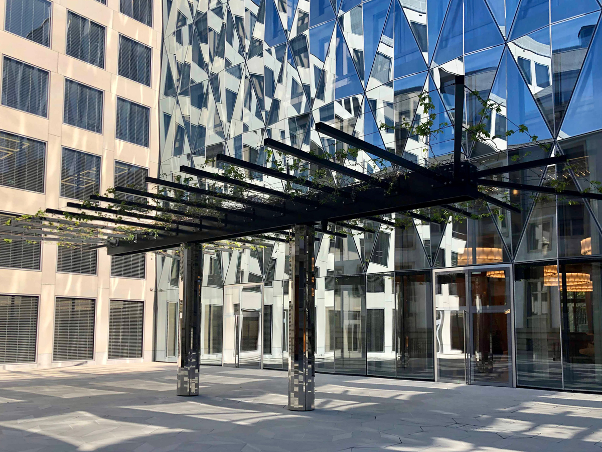
Located in Building E, the auditorium is the venue for various events on campus. The courtyard extends the auditorium outwards. A vegetative roof of climbing plants spans a volume open on the sides in its centre. This green yet permeable space serves as a place to stay and extends the auditorium as an outdoor area. The treillage, planted with self-climbing maidenhair vine and evergreen honeysuckle, rests on two mirrored columns that reflect the flooring and the surrounding buildings and create the impression of a vegetative "flying carpet".
The interior
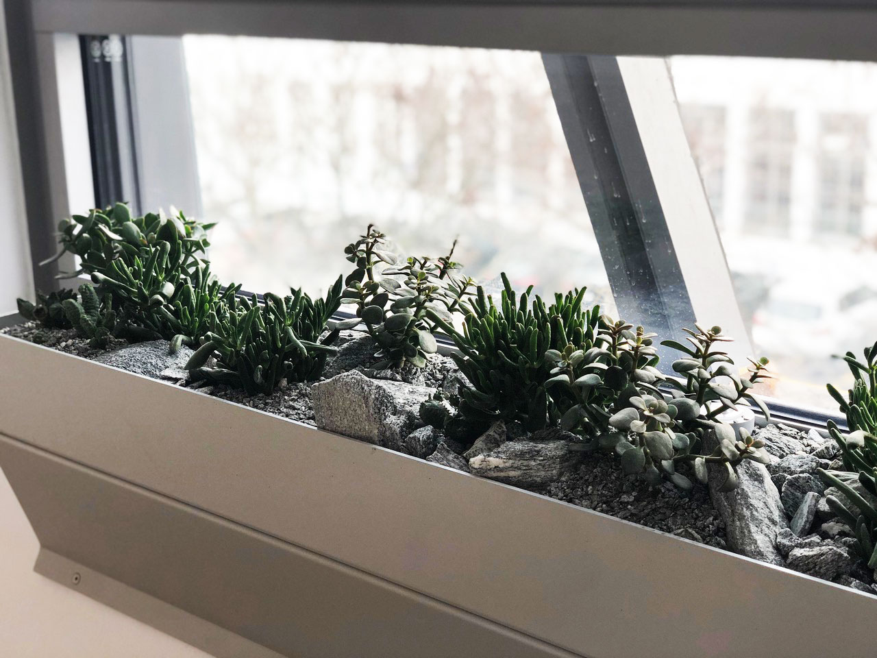
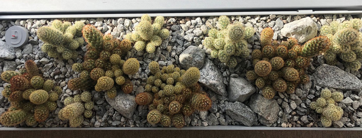
A site-specific greening concept was developed for the interiors of the new buildings, using the nearby succulent collection as a reference. The concept of the classic flower box was mirrored from the outside to the inside, and a so-called parapet box with succulents was placed in front of each window. Over 500 of these 160 cm long boxes were installed - making 820 linear metres of succulents. Each building is assigned its continent or a specific region of origin of the plants. Thus the boxes in building C are planted with plants from South America, in building B with plants from Mexico and in building E with plants from South Africa. Fine topographical modelling with gestures in different grain sizes underline the impression of a real landscape section and create subtle recognition values of the various buildings and room functions.


